
Project
An identity built to stay. Out of the way.
Visual identity and collateral for a restaurant in downtown San Francisco. Designed to operate with clarity, precision, and restraint, supporting daily use without asking for attention.

Overview
Where clarity does the talking.
Sushi Fantastic sits between San Francisco’s Financial District and SOMA, a place defined by a fast pace, tight schedules, and constant flow. The restaurant doesn’t compete with that rhythm; it counterbalances it. The brief was straightforward: create an identity that behaves with the same clarity and efficiency the space already demands, while respecting the cultural context of Japanese cuisine without relying on obvious visual references.
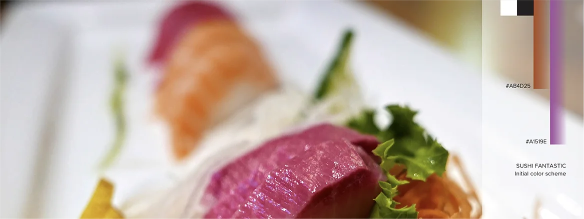
The design followed that directive: a system built to work. Typography stays light and precise, color remains pleasant but controlled, and layouts hold their structure without drawing attention. Professional photography leads the visual experience and carries the message. The identity was conceived as a frame for those images, organizing information without competing for attention in the final result.
Approach
Presence through precision.
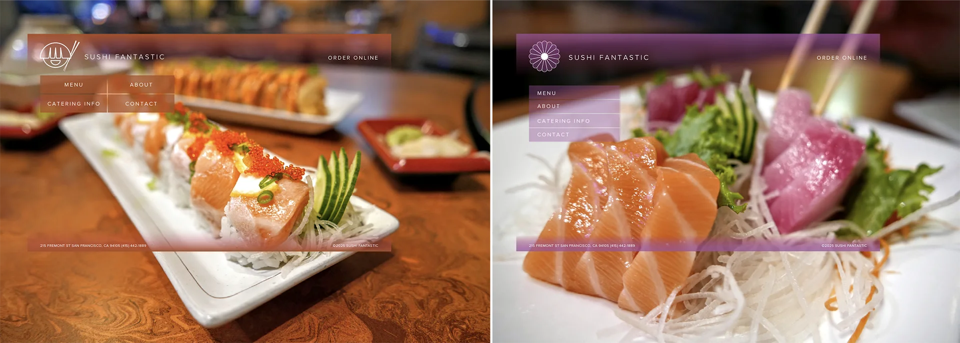
Fast outside, calm the moment you step in. The project began by understanding that shift in energy. From there, everything was reduced to what mattered. Two routes emerged: the chrysanthemum as lineage, the smiling sushi as presence. Showing both made the conversation sharper and clarified what the identity needed to express.
The work was guided by precision. Every decision (sketches, forms, proportions, contrast) was pushed until it held its purpose with clarity. The aim wasn’t minimalism for its own sake, but intent. The identity gives form to the experience without competing with it—present enough to guide, quiet enough not to interfere.

Result
An identity defined by when it steps forward—and when it doesn’t.
The system settles into the restaurant’s daily flow, legible at a glance, steady in repetition, and quiet enough to leave room for the experience itself. Nothing distracts, nothing overstates. The project underscored a principle that guides much of the studio’s work: the strongest identities succeed by knowing when to step forward and when to step back.